
Sarvaplay
Branding, Brand identity, Sports
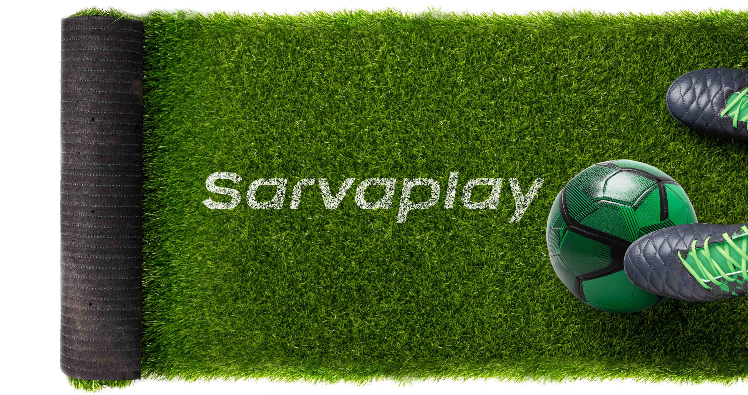
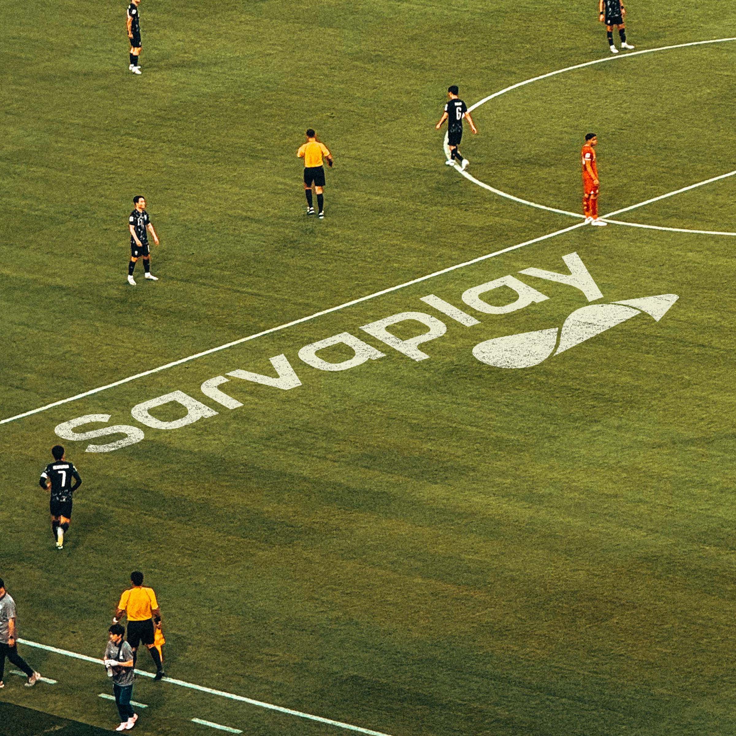
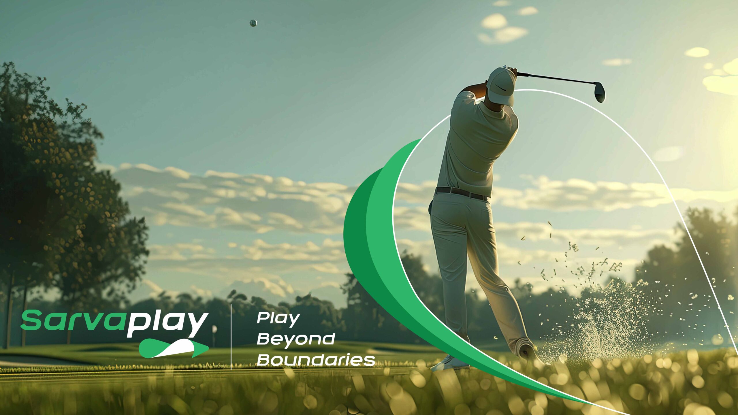
The grass is always greener on our side”—with this as their motto, Sarvaplay is committed to redefining the standards for artificial turf in India. Rooted in India, the brand focuses on boosting greenery in the most sustainable way, while also establishing a deep connection to local preferences, sports culture, and environmental needs.
Sarvaplay wanted a brand new identity that could capture their story of building connections, not just between people and spaces but also between nature and innovation. They wished for a visual language that could reflect their commitment to sustainability, performance, and the seamless integration of artificial turf into various environments, from sports arenas to urban landscapes. The identity had to communicate how their products could bring people closer to nature while maintaining durability.
To bring this vision to life, we designed a logo that positions Sarvaplay as a connector, bridging people and spaces through natural movement and activity. The logo visually separates the outer and inner parts of the turf, symbolising its versatility in both indoor and outdoor applications. The shape subtly resembles an infinity symbol, representing the endless possibilities that the product offers in enhancing spaces.
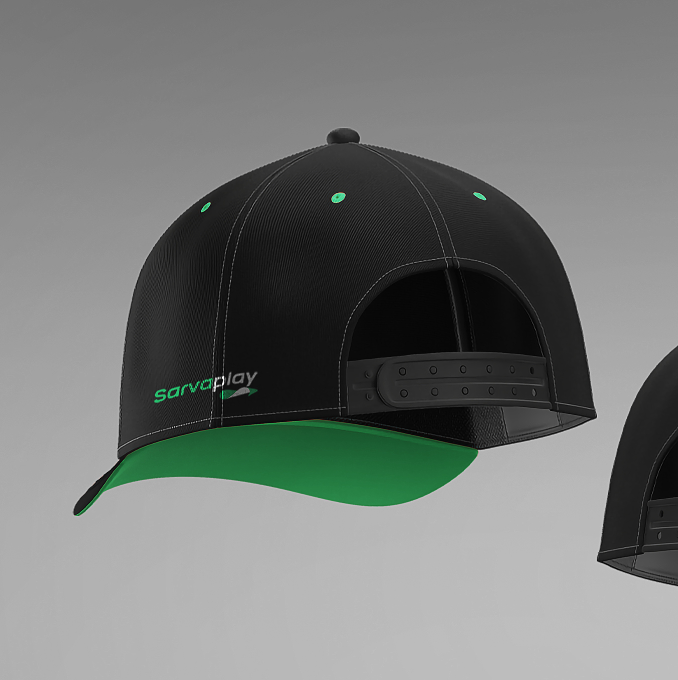
For the colour palette, we chose Jade Green to signify lush greenery, renewal, and sustainability, while the shade Charcoal adds a touch of strength, and resilience, thereby defining Sarvaplay’s commitment to long-lasting performance.