Linc Glycer
Packaging, Brand Identity, Stationery
Linc Pens – India’s leading stationery brand – has earned its place as a functional, reliable, high-quality writing pioneer. With a strong national and international presence in over 50 countries, Linc is synonymous with trust in the stationery market. Among its wide product range, the Linc Glycer ball pen stands out as a beloved choice for millions, known for its smooth writing experience and lasting performance.

The task was to refresh the packaging for Linc’s iconic Glycer ball pen – a product that has been cherished for years. The goal was to update its look and feel in order to align with current market trends while retaining the essence that made it a favourite among consumers.
The new packaging needed to be modern and dynamic, reflecting the product’s enduring quality and ensuring it remained competitive in a fast-evolving market.
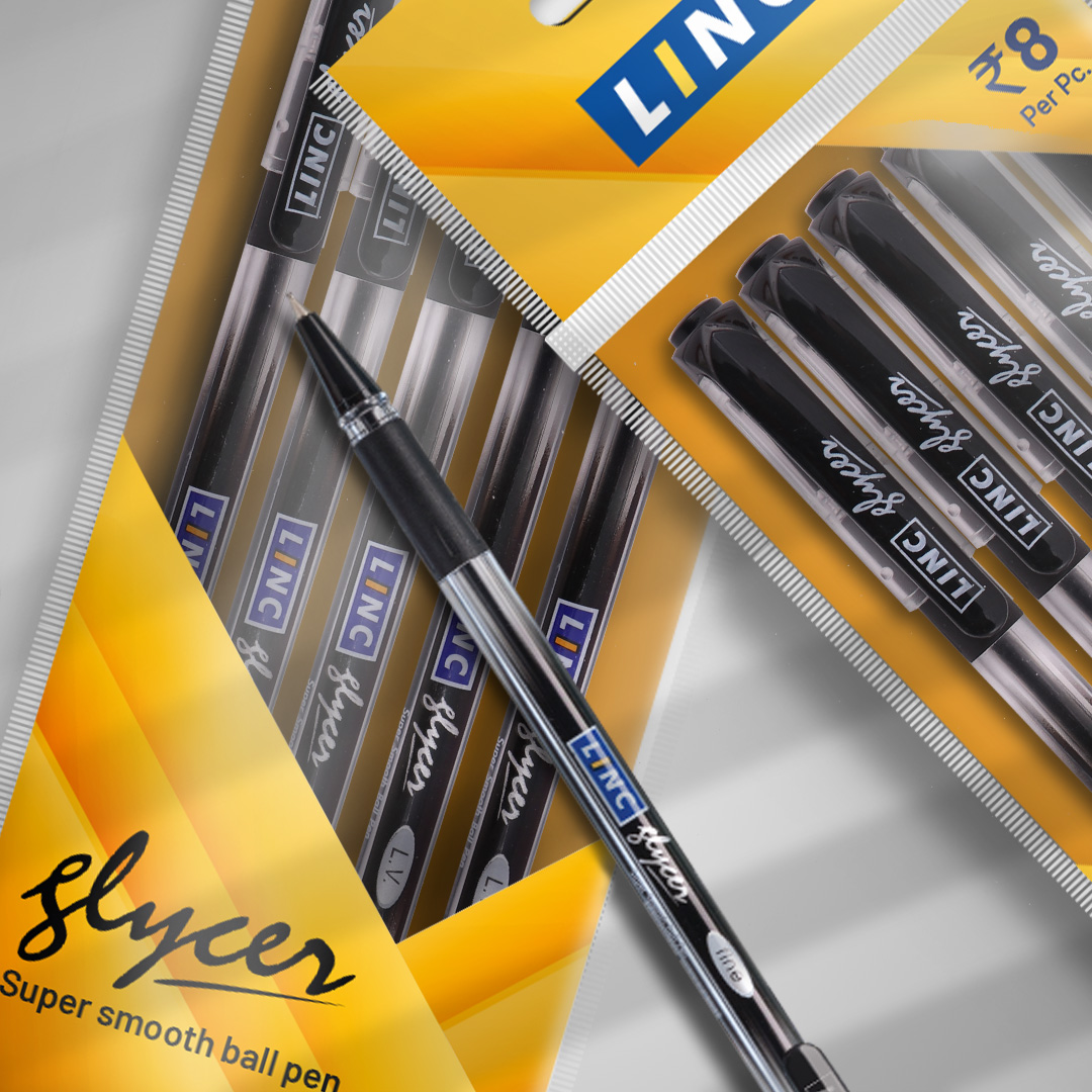
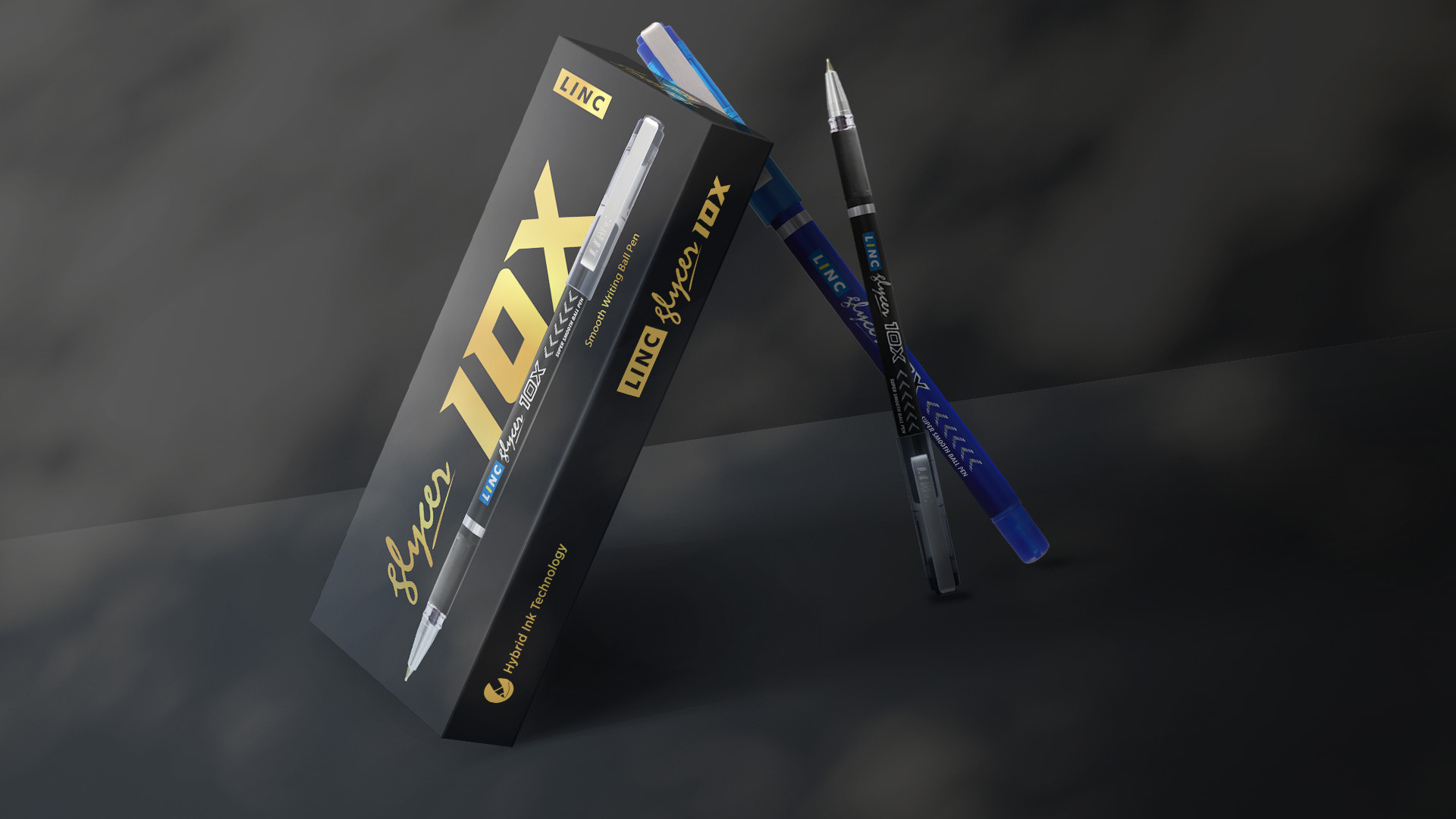
We redesigned Glycer’s packaging by retaining its signature yellow patch, a key element that consumers associate with the brand, but infused it with a fresh twist. The new design featured dynamic streaks in the iconic shade of yellow, symbolising the effortless glide of the pen on paper—a quality that has made Glycer a standout product. The packaging was designed for versatility, allowing it to be easily adaptable across various formats, including pouches, boxes, and display units.


