
Supra Scoop
Packaging, Brand Identity, Stationary
Supra Pens – a leading stationery brand of Kolkata – is all about making writing fun. With its cutting-edge Swiss technology, Supra is dedicated to delivering a seamless writing experience that maximises writing pleasure for every user.
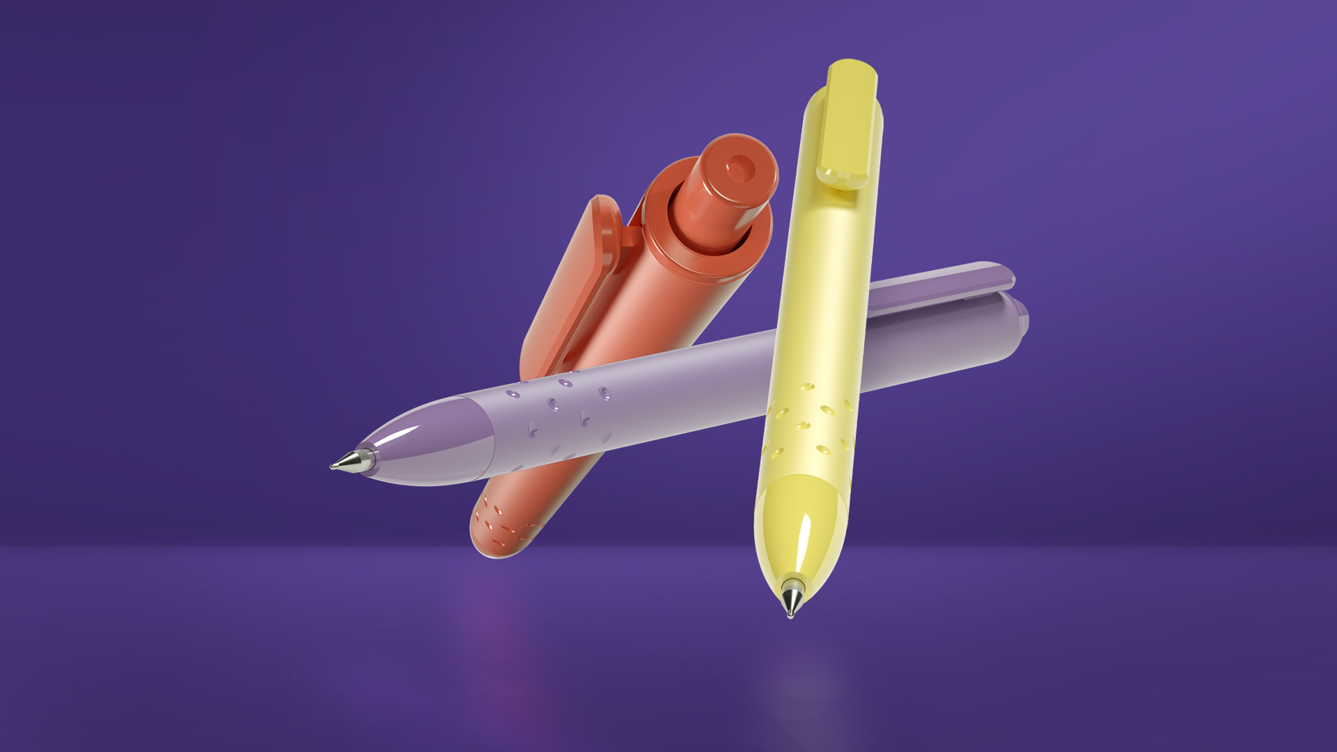
An innovative, colourful pen brand – Supra Scoop – was born from the fun-loving, quirky side of Gen Z. For this funky pen brand, Supra wished the capture the youthful side of the name through packaging that was eye-catching – stirring a sense of excitement among the TG!
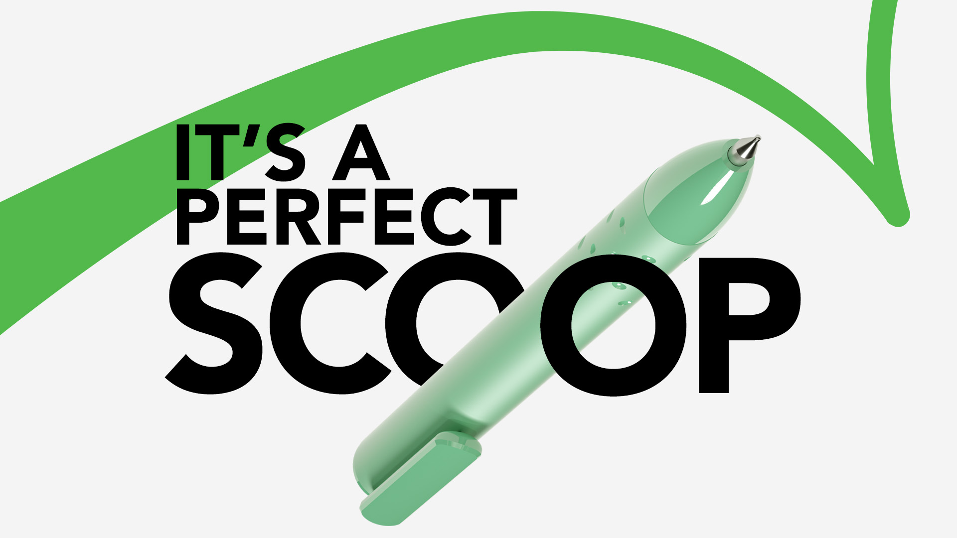
So, how did we scoop up the perfect packaging? By using elements that truly popped out! Bold stripes across the packaging visually represented the pen’s smooth, swift and adaptable writing. The circular windows further highlighted the pen’s vibrant colours and accentuated the dark blue background. Taking inspiration from the pen’s design, we even incorporated the visible dents or scoops that appeared on the pen’s body in the brand logo. Hence, imparting a fun character and appeal to Supra Scoop.