
Evereve
Packaging, Brand Identity, Menstrual Hygiene
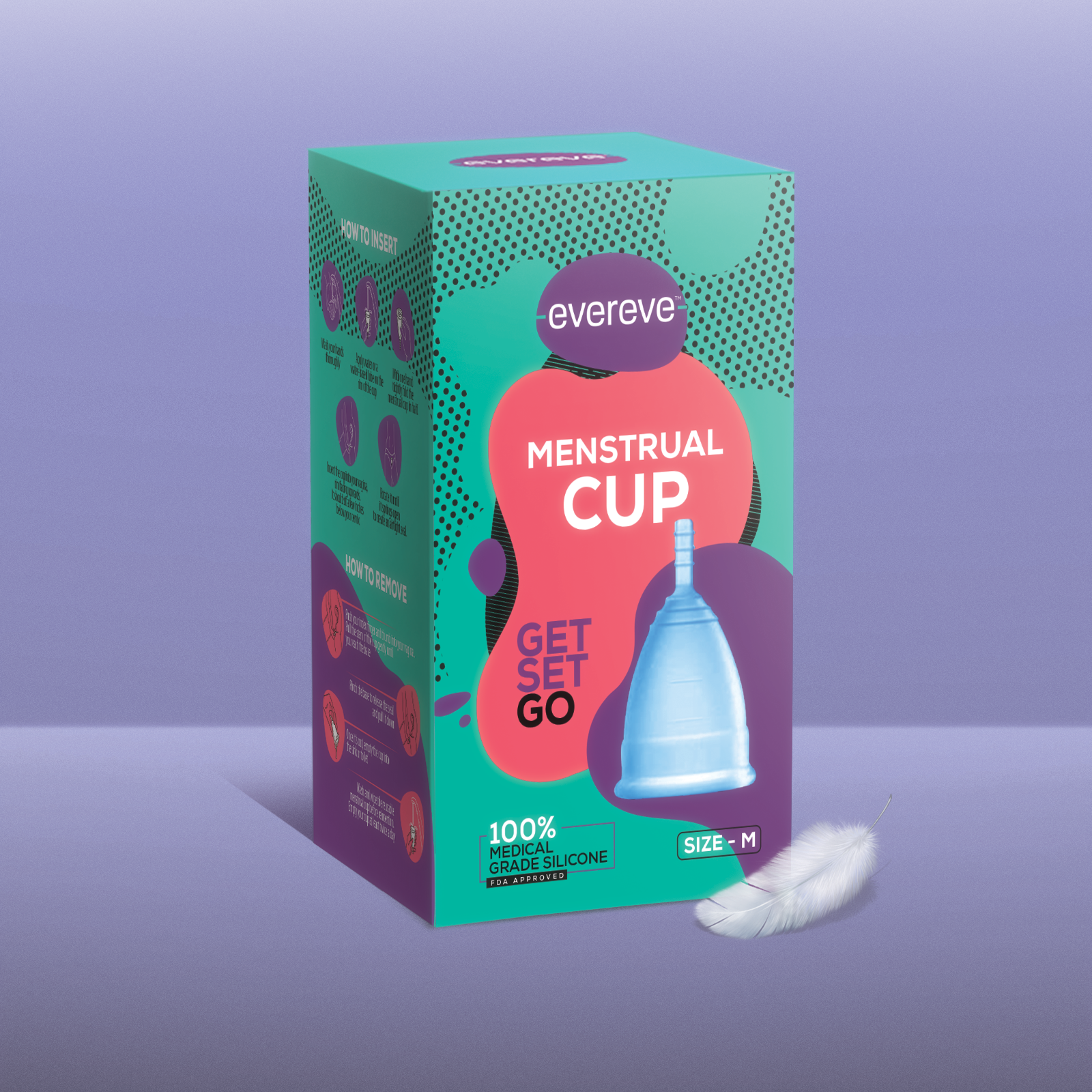
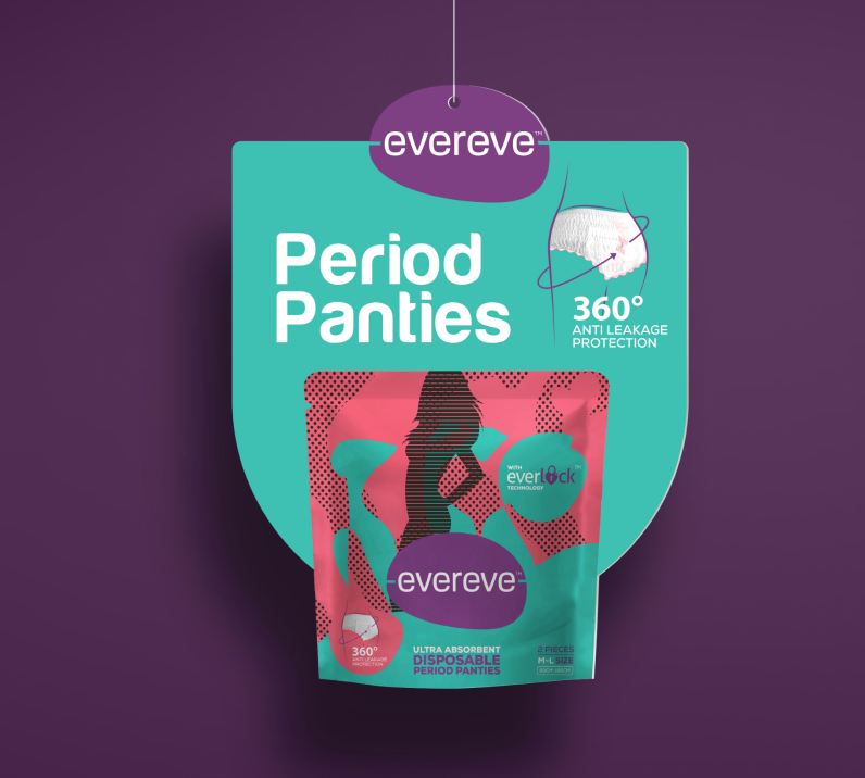
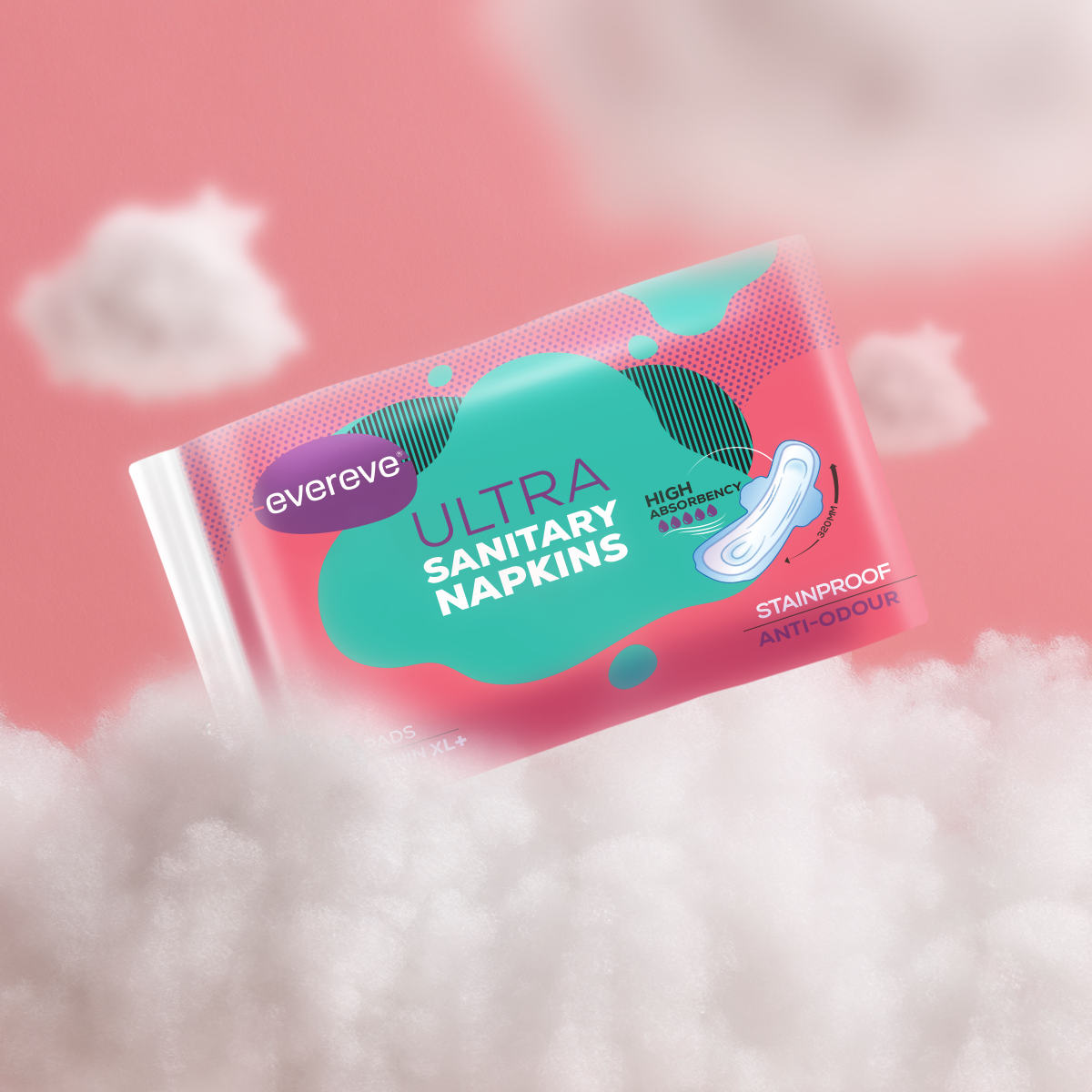
Easy, comfortable, and effortless—that’s how period days should be. This is the guiding principle behind Evereve, a feminine hygiene brand dedicated to making “that time of the month” as comfortable as the rest of the month with its range of menstrual cups and period panties.
Evereve wanted to create an arresting packaging treatment for their product – period panty – that reflected comfort and effectiveness of the product easily. The goal was to create a design communicated the superior functionality of the product through an aesthetic, smart appeal.
Understanding the audience was key to cracking the packaging design for this product. We identified two universal concerns for period care—staining and discomfort. This insight guided our approach, leading us to create innovative terms like “Everlock” for superior protection against leaks and “2xComfylogy” for enhanced comfort. We incorporated these key features into the design, ensuring that the packaging not only highlighted the practical benefits but also resonated with the brand’s promise. The chosen colour palette, aligned with feminine hygiene products and reflected the values of softness, care and reliability. Together, these elements came together to form a packaging solution that was both visually engaging and effective.