Nordusk
Packaging, Brand Identity, FMCG

Nordusk has been at the forefront of the LED revolution, crafting luminous solutions that blend cutting-edge engineering with environmental consciousness. The brand has become synonymous with innovation and quality, offering an extensive range of advanced LED lighting solutions that cater to various applications across multiple industries.
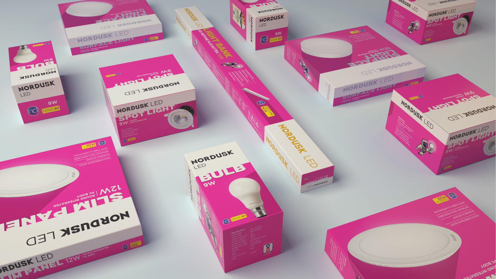
Nordusk’s previous packaging lacked consistency across its product line, creating challenges in a market where consumers prioritise product categories over brands. The key challenge was to make Nordusk LED lights stand out and capture the attention of the target audience instantly and foster brand loyalty.
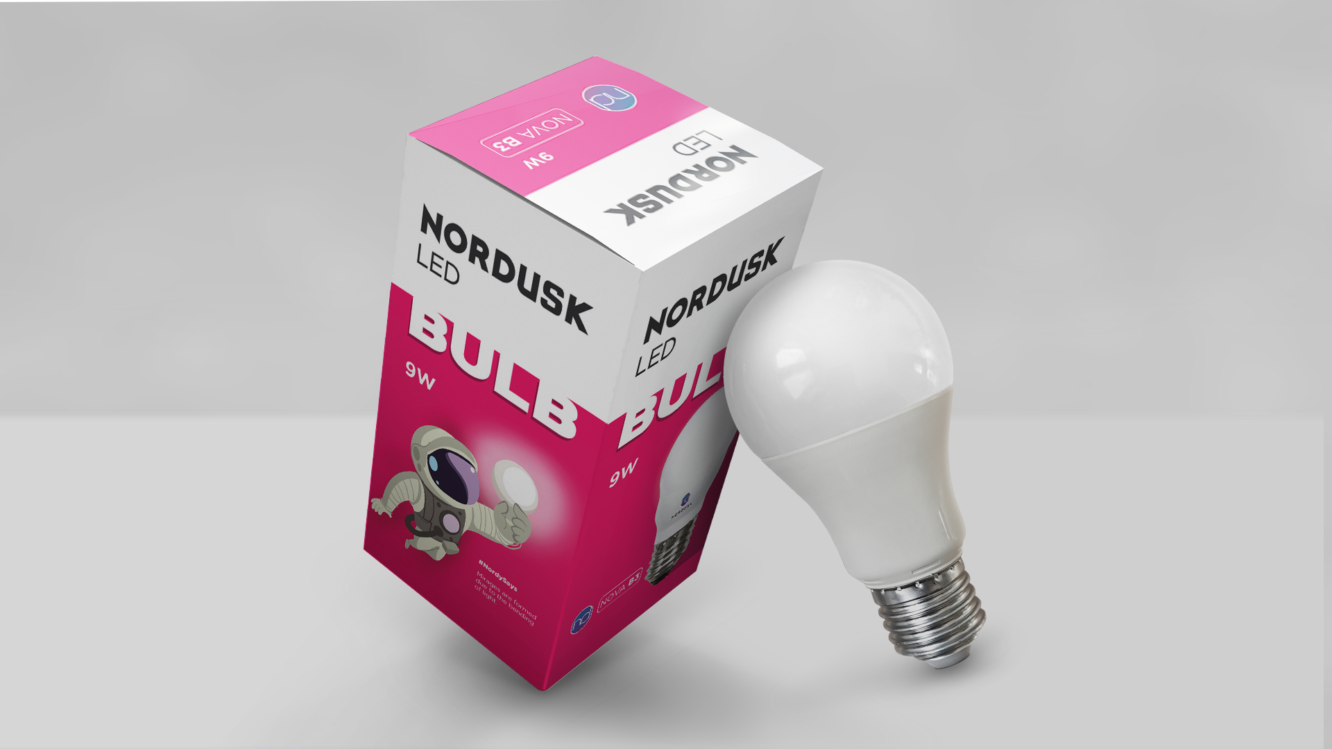
Our approach to addressing the market clutter in the LED lights category began with in-depth research to identify a distinctive packaging colour that would stand out. We chose neon pink, ensuring high visibility even in dimly lit shops, making the packaging itself appear to glow like its lights. Additionally, we highlighted the category names on the packaging through a bold font that one could instantly associate the product with in the light category. A brand mascot, Nordy — an astronaut — was also introduced on the packaging, symbolising Nordusk’s promise of delivering “out of the world” lighting solutions. Nordusk defied industry trends with a remarkable 20% month-on-month growth. This achievement is a testament to the power of innovative packaging and the brand’s unwavering commitment to excellence.


